Form Field Settings
This article covers the settings available when configuring Form Fields in a Form Template.
Requirements
Basic knowledge of Forms is required.
Functionality
Each Form Field type has its own settings and configurations.
Text
The following fields are available for Text Form Fields:
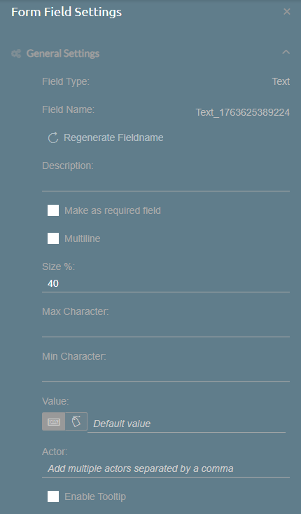
- Field Type: Indicates the Form Field Type, in this case, Text.
- Field Name: Unique name for the Form Field. You can regenerate a new Field Name through the Regenerate Fieldname button below.
- Description: A short description of the Form Field.
- Make as required field: When enabled, the Form Field will require an input from a user before submitting the Form. A red asterisk will be shown at the right side of the Form Field.
- Multiline: When enabled, the Form Field allows adding line spaces.
- Line count: When Multiline is enabled, this sets the number of line spaces added to the Form Field.
- Size: Sets the Form Field's width, proportional to the size of the section.
- Max Character: Sets the maximum number of characters allowed to be inputted.
- Min Character: Sets the minimum number of characters allowed to be inputted.
- Value: Sets a predetermined value for the Form Field.
- Static Text: Manually input the predetermined value.
- Datasource Field: Select a field from SuccessFactors to use as predetermined values.
- Actor: Specifies who can modify or edit the Form Field.
- Enable Tooltip: Allows users to include tooltips to help users on what to do with the Form Field.
- Tooltip Text: Enter the text that appears when hovering over the Form Field or clicking the tooltip icon. It accepts up to 255 characters and must not be empty.
- Enable Tooltip Icon: When enabled, a tooltip icon is shown to the right side of the Form Field. This icon can be clicked to show the tooltip text.
Numeric
The following fields are available for Numeric Form Fields:

- Field Type: Indicates the Form Field Type, in this case, Number.
- Field Name: Unique name for the Form Field. You can regenerate a new Field Name through the Regenerate Fieldname button below.
- Description: A short description of the Form Field.
- Make as required field: When enabled, the Form Field will require an input from a user before submitting the Form. A red asterisk will be shown at the right side of the Form Field.
- Size: Sets the Form Field's width, proportional to the size of the section.
- Max Value: Sets the maximum value allowed to be inputted.
- Min Value: Sets the minimum value allowed to be inputted.
- Value: Sets a predetermined value for the Form Field.
- Static Text: Manually input the predetermined value.
- Datasource Field: Select a field from SuccessFactors to use as predetermined values.
- Numeric Input Format: When enabled, the formatting for numbers is set to X,XXX.XX, where commas are used as the grouping separator, and periods as the decimal separator.
- Actor: Specifies who can modify or edit the Form Field.
- Enable Tooltip: Allows users to include tooltips to help users on what to do with the Form Field.
- Tooltip Text: Enter the text that appears when hovering over the Form Field or clicking the tooltip icon. It accepts up to 255 characters and must not be empty.
- Enable Tooltip Icon: When enabled, a tooltip icon is shown to the right side of the Form Field. This icon can be clicked to show the tooltip text.
- Display value as is: When enabled, the formatting for numbers follows the input of the user or the predetermined value defined. When disabled, other editing options below are shown. This option cannot be disabled if Numeric Input Format is enabled.
- Preview: See a preview of how the number would look like when inputted to the Form Field.
- Grouping Separator: Set the thousands separator to a comma, period, apostrophe, a space, or none.
- Decimal Separator: Set the decimal separator to either a comma or a period.
- Decimal Places: Set how many decimal places after the decimal separator are allowed.
- Rounding Options: Set if the number should be rounded up or rounded down to the nearest ones, or not.
Date
The following fields are available for Date Form Fields:
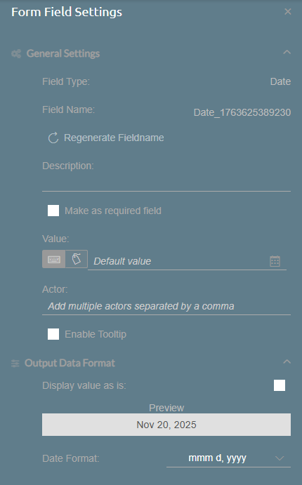
- Field Type: Indicates the Form Field Type, in this case, Date.
- Field Name: Unique name for the Form Field. You can regenerate a new Field Name through the Regenerate Fieldname button below.
- Description: A short description of the Form Field.
- Make as required field: When enabled, the Form Field will require an input from a user before submitting the Form. A red asterisk will be shown at the right side of the Form Field.
- Value: Sets a predetermined value for the Form Field.
- Static Text: Manually input the predetermined value through a date picker.
- Datasource Field: Select a field from SuccessFactors to use as predetermined values.
- Actor: Specifies who can modify or edit the Form Field.
- Enable Tooltip: Allows users to include tooltips to help users on what to do with the Form Field.
- Tooltip Text: Enter the text that appears when hovering over the Form Field or clicking the tooltip icon. It accepts up to 255 characters and must not be empty.
- Enable Tooltip Icon: When enabled, a tooltip icon is shown to the right side of the Form Field. This icon can be clicked to show the tooltip text.
- Display value as is: When enabled, the formatting for dates follows the input of the user or the predetermined value defined. When disabled, other editing options below are shown.
- Preview: See a preview of how the date would look like when inputted to the Form Field.
- Date Format: Select from a list of date formats.
Rating
The following fields are available for Rating Form Fields:
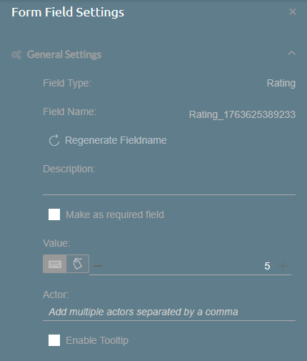
- Field Type: Indicates the Form Field Type, in this case, Rating.
- Field Name: Unique name for the Form Field. You can regenerate a new Field Name through the Regenerate Fieldname button below.
- Description: A short description of the Form Field.
- Make as required field: When enabled, the Form Field will require an input from a user before submitting the Form. A red asterisk will be shown at the right side of the Form Field.
- Value: Sets a predetermined value for the Form Field.
- Static Text: Manually input the predetermined value from 0 to 5.
- Datasource Field: Select a field from SuccessFactors to use as predetermined values.
- Actor: Specifies who can modify or edit the Form Field.
- Enable Tooltip: Allows users to include tooltips to help users on what to do with the Form Field.
- Tooltip Text: Enter the text that appears when hovering over the Form Field or clicking the tooltip icon. It accepts up to 255 characters and must not be empty.
- Enable Tooltip Icon: When enabled, a tooltip icon is shown to the right side of the Form Field. This icon can be clicked to show the tooltip text.
The following fields are available for Email Form Fields:
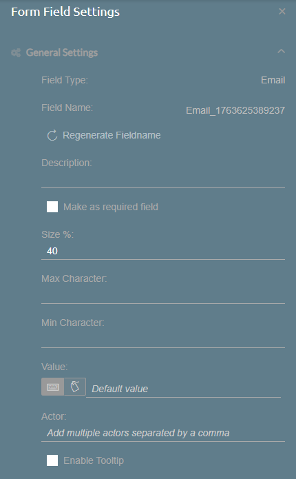
- Field Type: Indicates the Form Field Type, in this case, Email.
- Field Name: Unique name for the Form Field. You can regenerate a new Field Name through the Regenerate Fieldname button below.
- Description: A short description of the Form Field.
- Make as required field: When enabled, the Form Field will require an input from a user before submitting the Form. A red asterisk will be shown at the right side of the Form Field.
- Size: Sets the Form Field's width, proportional to the size of the section.
- Max Character: Sets the maximum number of characters allowed to be inputted.
- Min Character: Sets the minimum number of characters allowed to be inputted.
- Value: Sets a predetermined value for the Form Field.
- Static Text: Manually input the predetermined value.
- Datasource Field: Select a field from SuccessFactors to use as predetermined values.
- Actor: Specifies who can modify or edit the Form Field.
- Enable Tooltip: Allows users to include tooltips to help users on what to do with the Form Field.
- Tooltip Text: Enter the text that appears when hovering over the Form Field or clicking the tooltip icon. It accepts up to 255 characters and must not be empty.
- Enable Tooltip Icon: When enabled, a tooltip icon is shown to the right side of the Form Field. This icon can be clicked to show the tooltip text.
- Tooltip Text: Enter the text that appears when hovering over the Form Field or clicking the tooltip icon. It accepts up to 255 characters and must not be empty.
Upload File
The following fields are available for Upload File Form Fields:
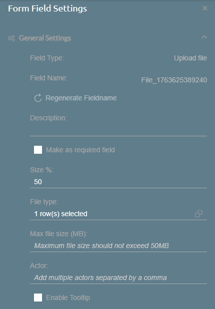
- Field Type: Indicates the Form Field Type, in this case, Upload File.
- Field Name: Unique name for the Form Field. You can regenerate a new Field Name through the Regenerate Fieldname button below.
- Description: A short description of the Form Field.
- Make as required field: When enabled, the Form Field will require an input from a user before submitting the Form. A red asterisk will be shown at the right side of the Form Field.
- Size: Sets the Form Field's width, proportional to the size of the section.
- File Type: Sets the file type allowed to be uploaded. Currently, only PDF files are accepted.
- Max File Size: Sets the maximum file size allowed to be uploaded, up to 50MB. If left blank, the maximum file size is set to 50MB.
- Actor: Specifies who can modify or edit the Form Field.
- Enable Tooltip: Allows users to include tooltips to help users on what to do with the Form Field.
- Tooltip Text: Enter the text that appears when hovering over the Form Field or clicking the tooltip icon. It accepts up to 255 characters and must not be empty.
- Enable Tooltip Icon: When enabled, a tooltip icon is shown to the right side of the Form Field. This icon can be clicked to show the tooltip text.
Dropdown List
The following fields are available for Dropdown List Form Fields:
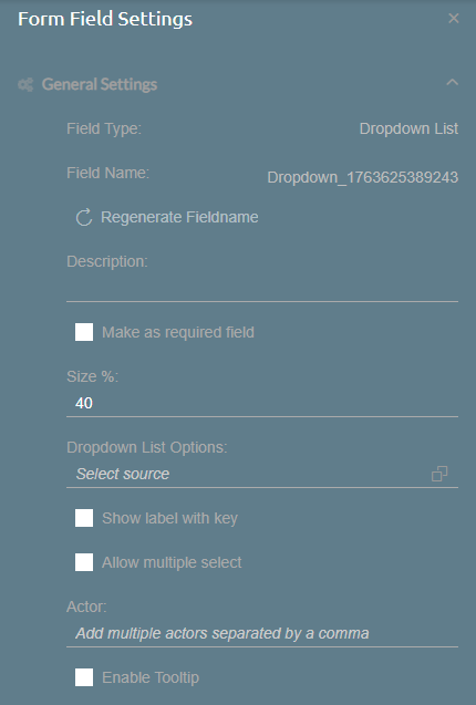
- Field Type: Indicates the Form Field Type, in this case, Dropdown List.
- Field Name: Unique name for the Form Field. You can regenerate a new Field Name through the Regenerate Fieldname button below.
- Description: A short description of the Form Field.
- Make as required field: When enabled, the Form Field will require an input from a user before submitting the Form. A red asterisk will be shown at the right side of the Form Field.
- Size: Sets the Form Field's width, proportional to the size of the section.
- Dropdown List Options: Allows users to select the source list of values that the Form Field shows. If the source is a Picklist, the options below are not shown.
- Assigned Key: Sets a field from the source list to be assigned as the key.
- Assigned Label: Sets a field from the source list to be displayed as the label.
- Show label with key: When enabled, the keys for each label are shown when selecting from the Form Field.
- Allow multiple select: When enabled, the Form Field allows for multiple selections at the same time.
- Actor: Specifies who can modify or edit the Form Field.
- Enable Tooltip: Allows users to include tooltips to help users on what to do with the Form Field.
- Tooltip Text: Enter the text that appears when hovering over the Form Field or clicking the tooltip icon. It accepts up to 255 characters and must not be empty.
- Enable Tooltip Icon: When enabled, a tooltip icon is shown to the right side of the Form Field. This icon can be clicked to show the tooltip text.